Google has changed its Chrome Browser logo for the first time in 8 years. A company designer said it adopted a simpler look intended to better match Google’s current brand. But some of the users might not even notice.
![]()
Photo Source: Google
Google’s first logo arrived in 2019 with a circular, four-color basic design and revamped in 2011. It also used shadows and gradient colors to revamp in 2014. The company has been redesigned the logo with flat colors instead of gradient colors to make it more visually appealing to the company. There don’t have many changes but the logo will be brighter than before, the blue circle in the middle will get bigger and the shadows will be removed.
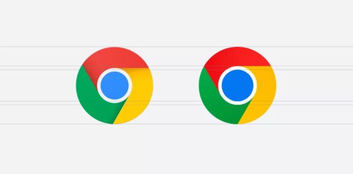
Photo Source: Google